Postmates Redesign
User Research / UX / UI
Team with Vincent Mou and Rudiampai Kuonsongtham
New York
Oct. 2018 - Nov. 2018
POSTMATES MOBILE APPLICATION
ABOUT
Postmates is an urban Logistics platform that connects customers with local couriers who can deliver anything from any store or restaurant in minutes.
GOALS
Empower communities to shop local with no waiting, and empower businesses through their API to offer delivery.
HEADQUATERS : San Francisco, CA
FOUNDED : May 1, 2011
FOUNDERS : Bastian Lehmann, Sean Plaice, Sam Street

POSTMATES MAIN PROBLEMS
HOME PAGE:
— Do not know what the user got from the homepage
— It is not clear Enough
— Have only recommendation
— Do not have the filter to help people decide
— Not so attractive/looks like healthy food
VISUAL:
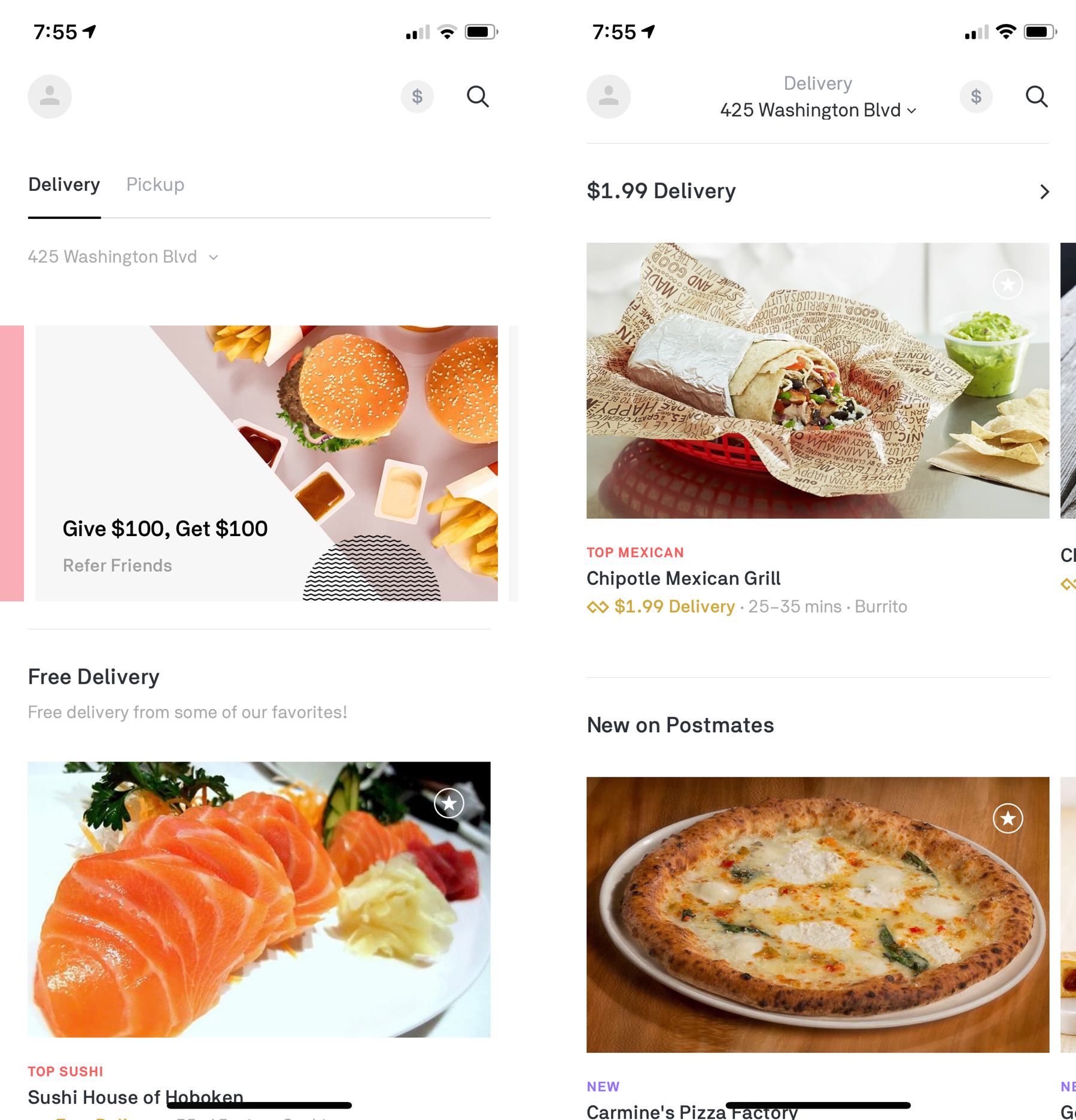
— Main color of the app are black and white/do not enhance appetite
— Do not include enough informatation/not much detail about the food itself
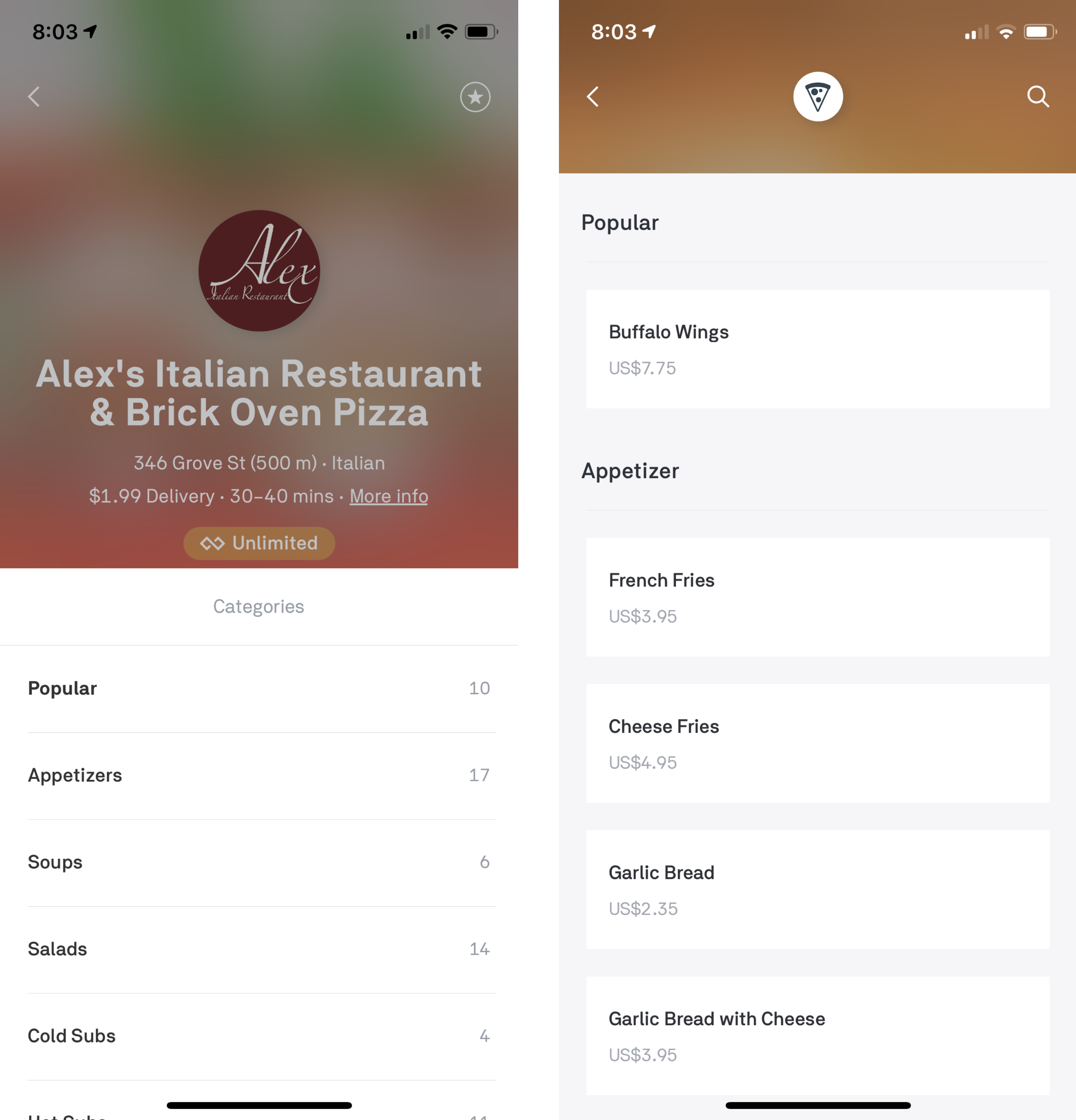
MENU:
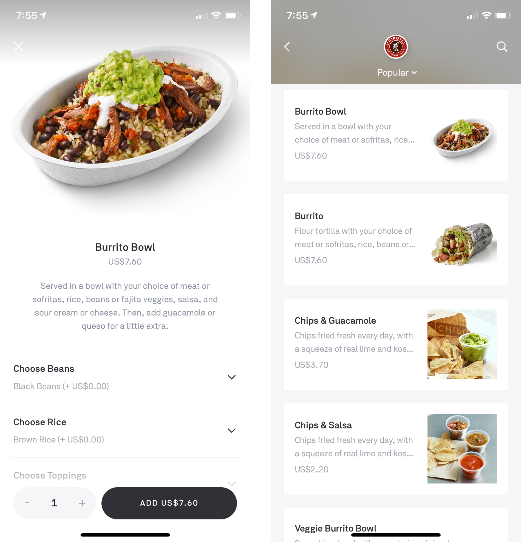
— Not consistency
— Many of the restaurant menu do not have picture/people want to see picture, they do not want to see much details
STEPS:
— The process is too long, too much choices
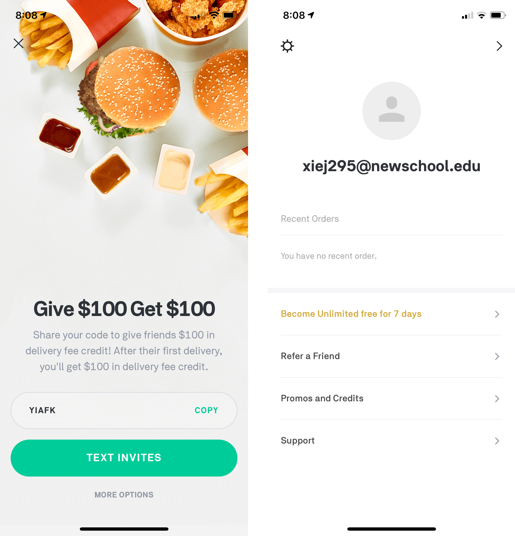
SETTING AND PERSONAL ACCOUNT:
— Not well organized
PERSONA
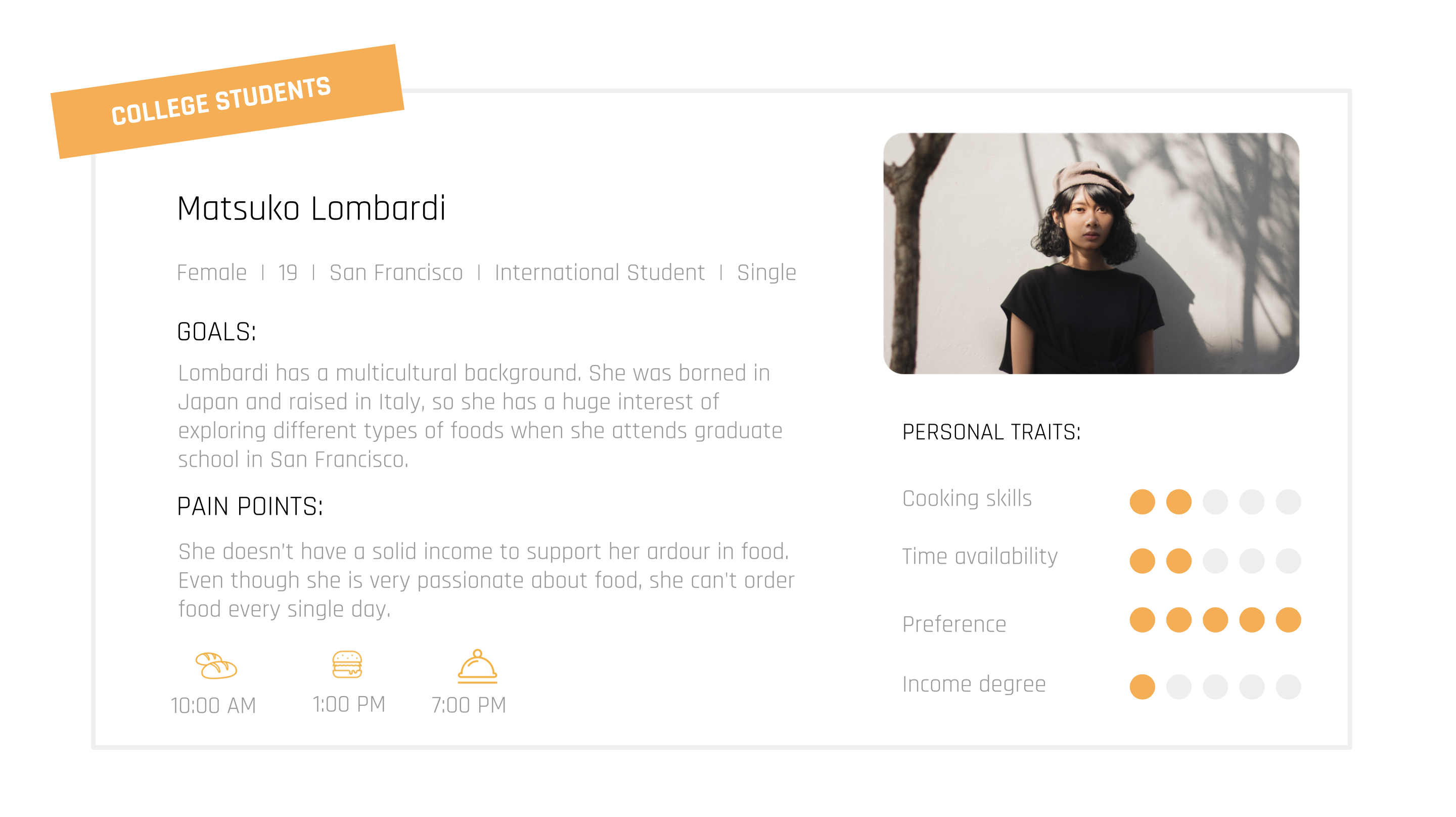
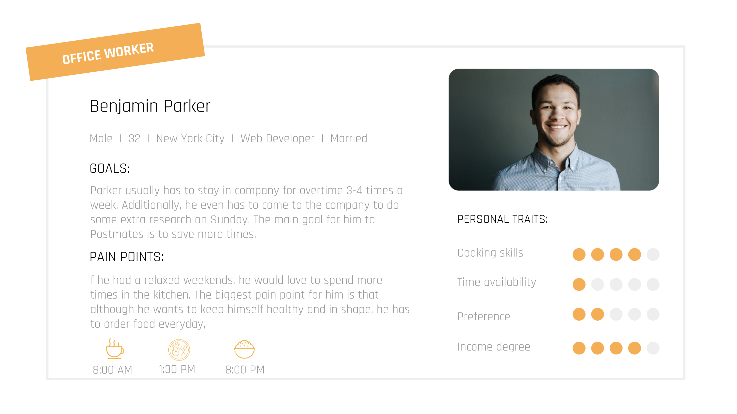
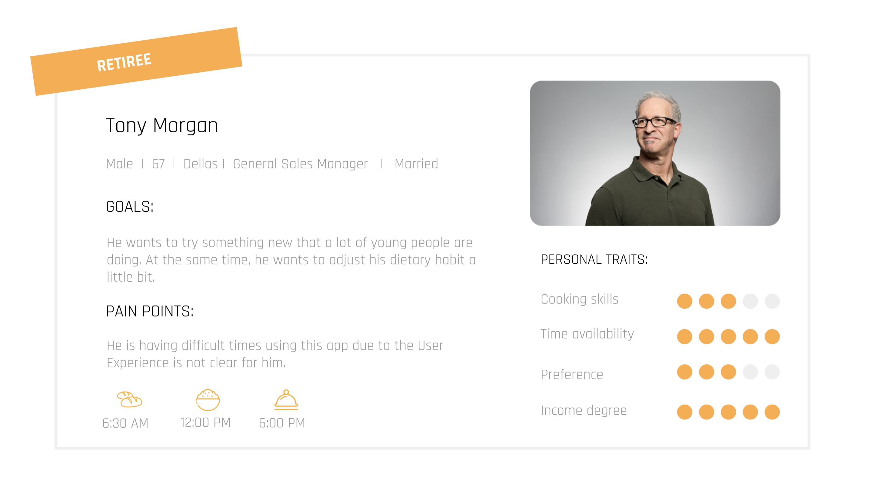
Through our investigations and research works, we create persona for the three main user groups: students, office workers and retiree.
REDESIGN PARTS
- Redesign homepage
- Combine setting and personal account
- Popup coupon at the homepage
- Arrange the information in the checkout page
HOME PAGE
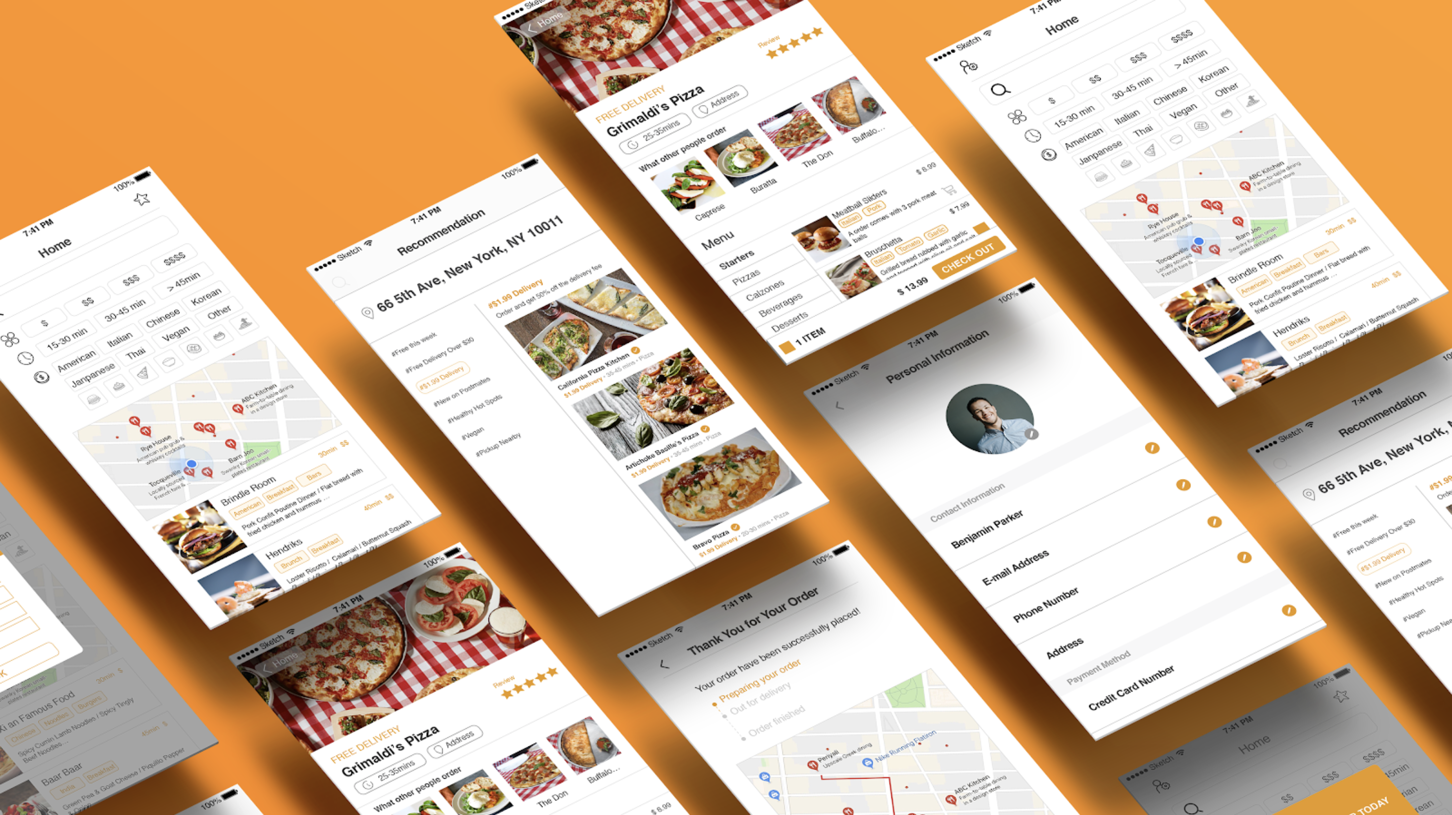
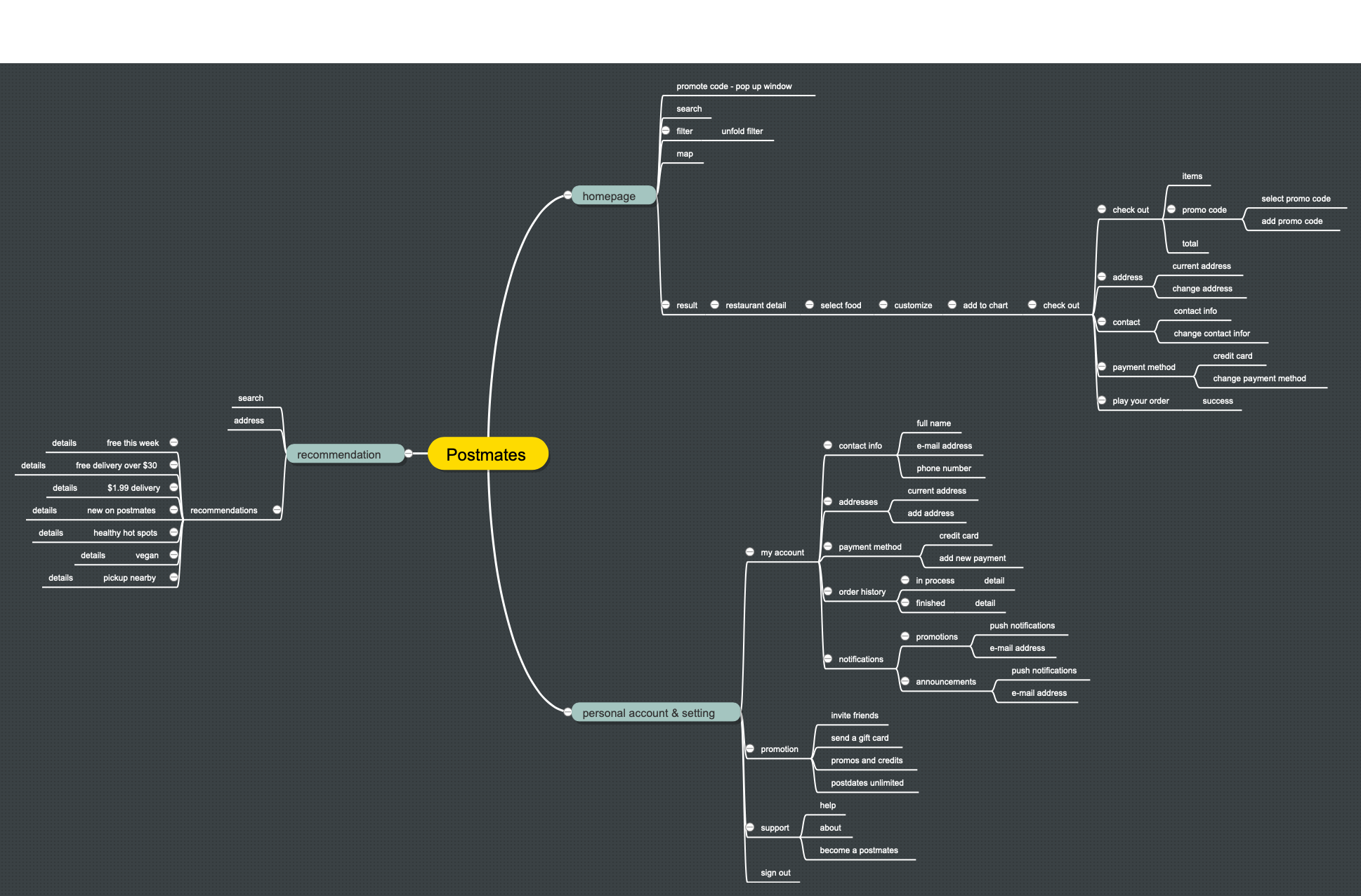
We redesign the home page with coupon in a pop up window. A search box which is followed by a filter is easier for users to decide what to order. The recommendation results are located in maps and show the detail information as follows.
RECOMMENDATION PAGE
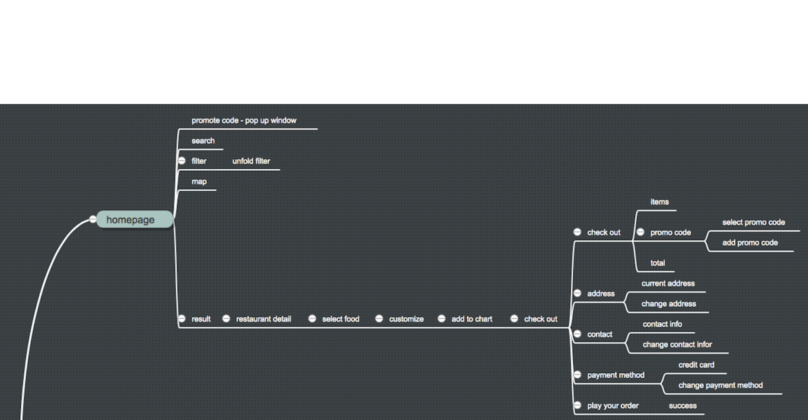
We re-arranged the recommendation page to make the classification of the information clearer and easier to understand. It also allows the recommendation page to help users make better decisions.
PERSONAL ACCOUNT AND SETTING
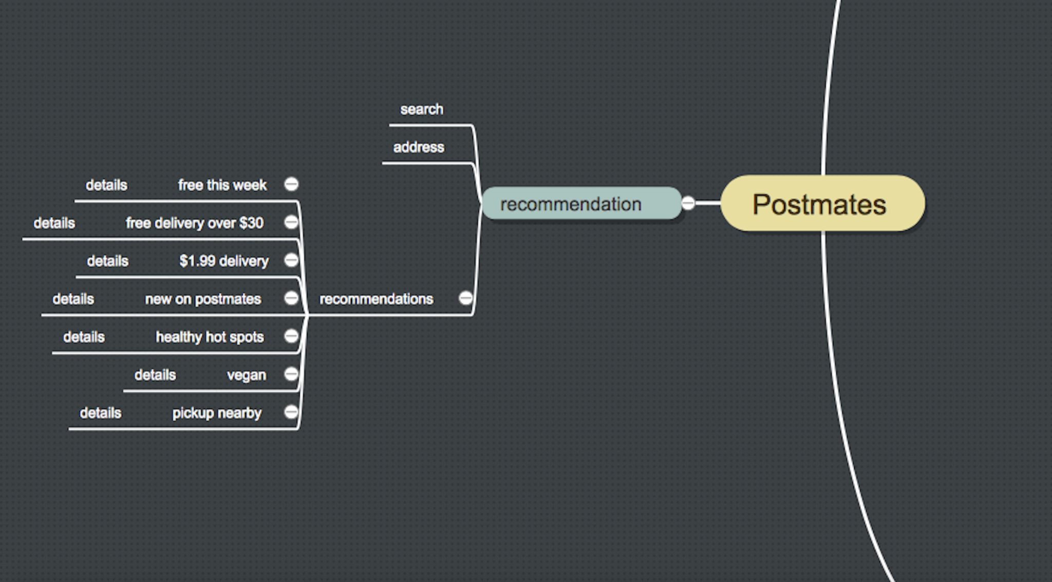
We combine the personal account and setting to simplify the app. When the user needs to query any account-related information and modify or set the account, it can be operated through the same entry.
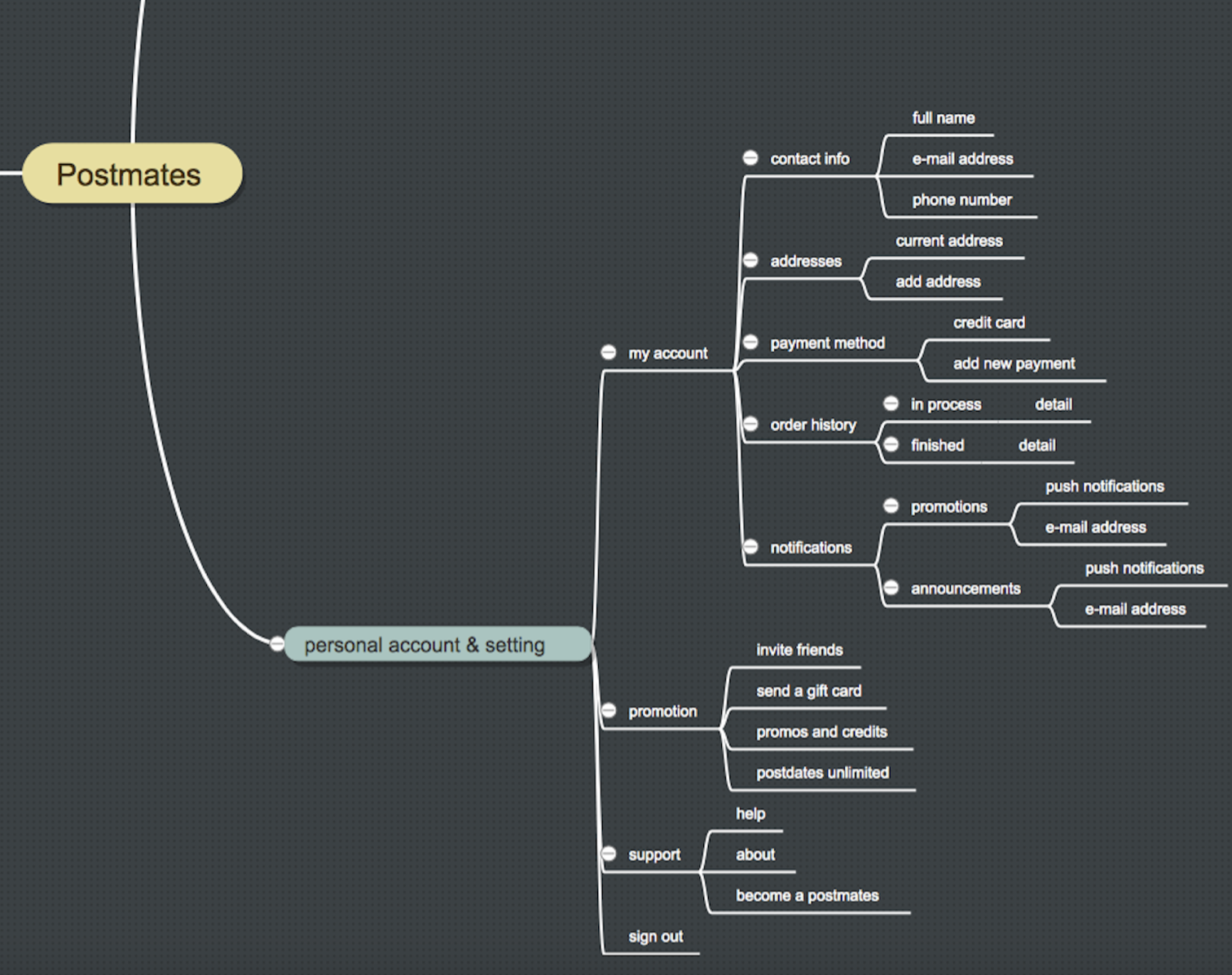
PROTOTYPE 1.0
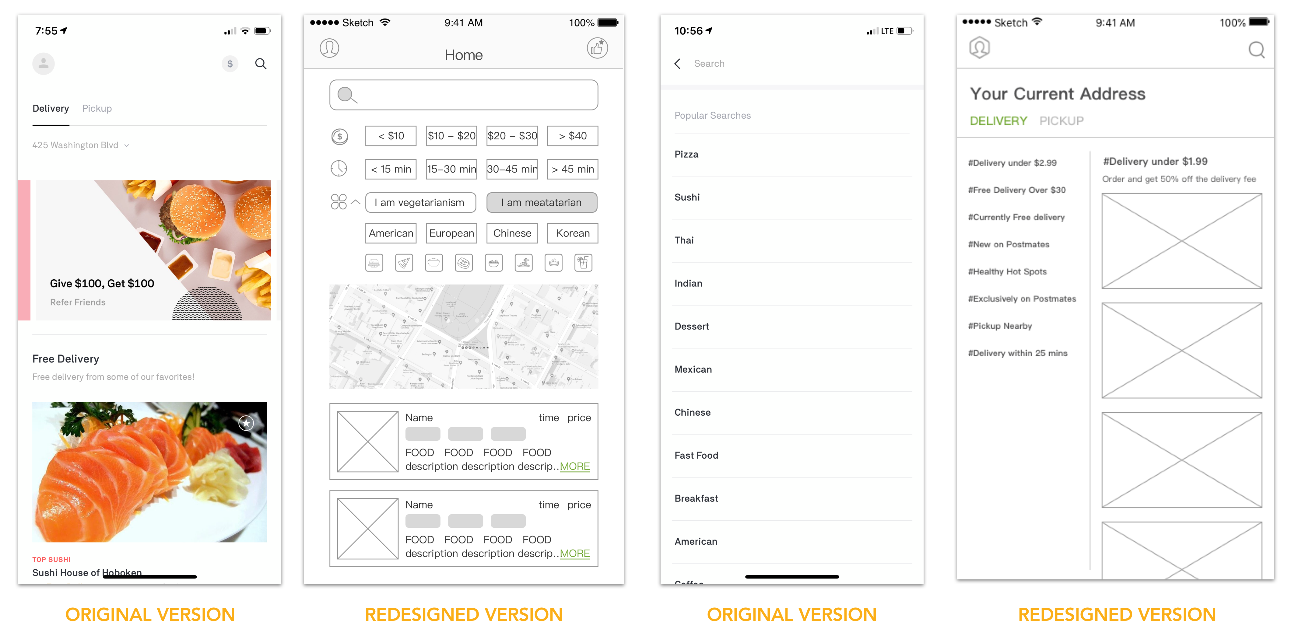
USER TEST AND FEEDBACK
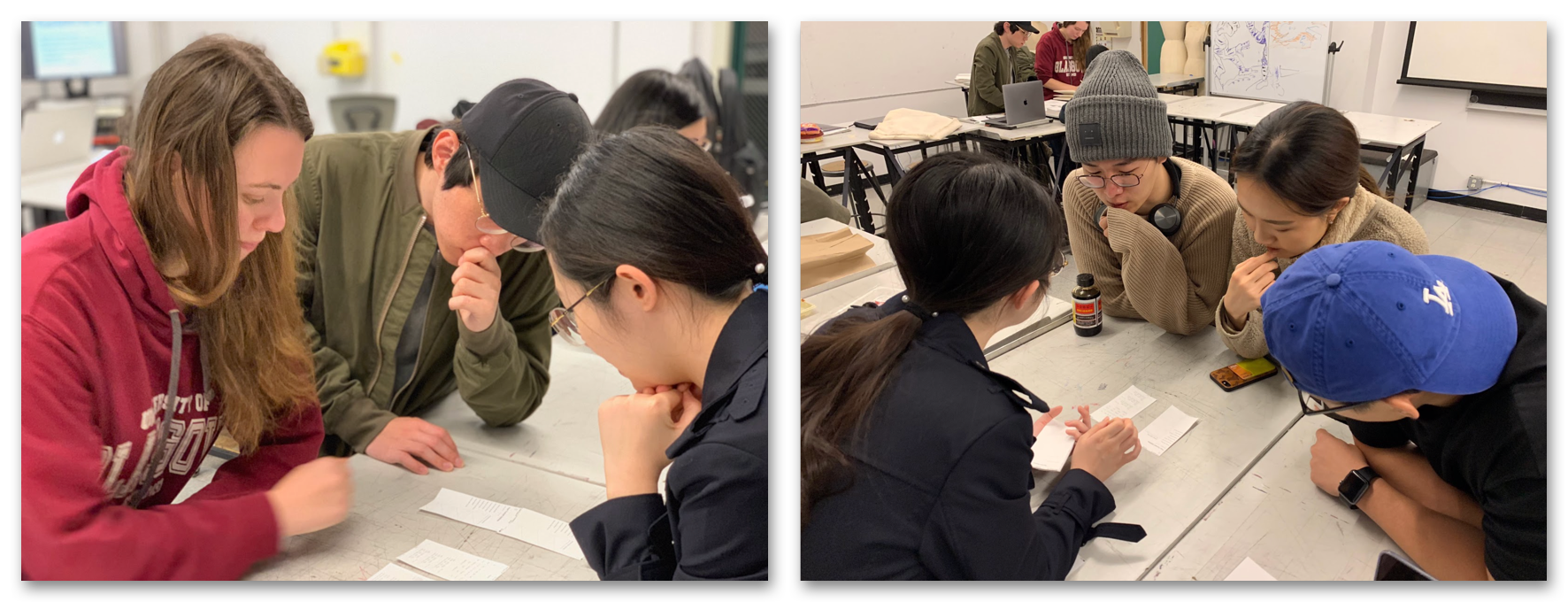
FEEDBACK
- Promo Code will popup in the home page and automatically fill out in the payment page
- Actual traveling map will show after the payment succeed
- Review is added
- Users can customize the food
- Improve the recommendation page
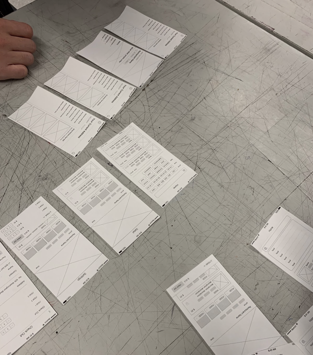
PROTOTYPE 2.O & FEEDBACK
- Decide on the homepage
- Track page
- Coupon popup in the homepage
- Add the PromoCode to the checkout page
- Simplify the filter
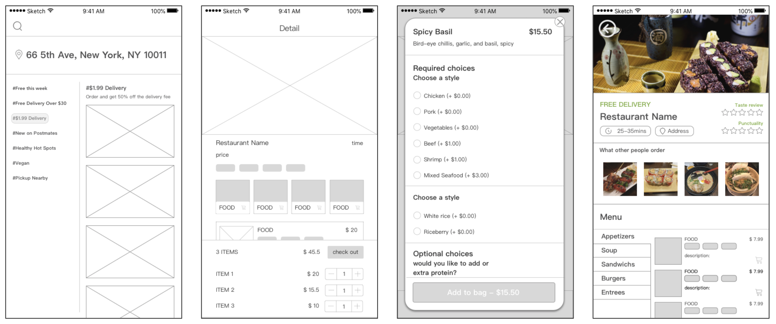
STYLE GUIDE
Before we started the user interface design, we created a style guide. We choose black, white and orange as the main color for Postmates, since orange can enhance users' appetite.
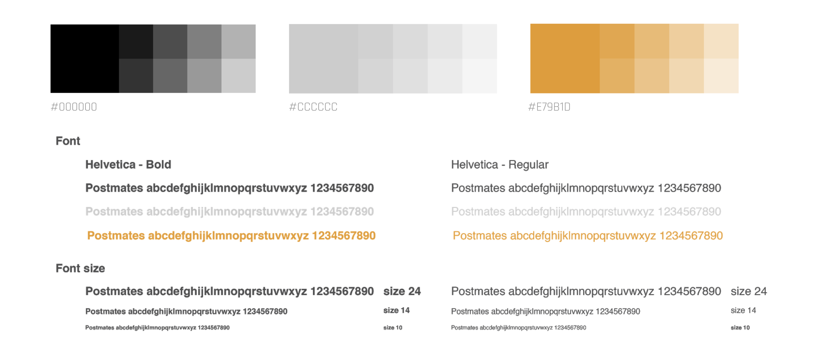
USER INTERFACE DESIGN

INTERACTION DESIGN
Prototype Video of Postmates Re-design
FUTURE ITERATION
- Delivery grocery store stuff ex. fruits and frozen food
- None prescriptive Medicine ex.
- Fastfood
- Make the setting page less wordy and use icon instead
